“Towing the line between classic and modern, this Italian apartment explores colour and form in a completely refreshing and somewhat romantic way.”
–
words Leanne Amodeo
photography Carola Ripamonti

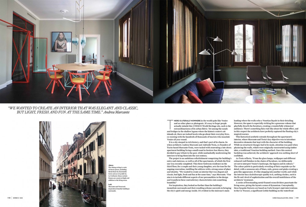
“There is literally nowhere in the world quite like Venice and no other place as photogenic. It’s easy to forget people actually inhabit this UNESCO World Heritage site, such is the extraordinariness of its urban fabric. Yet among the canals and bridges in the shallow lagoon where the historic centre’s 118 islands sit, there are indeed locals who go about their everyday lives, co-existing with the hundreds of thousands of tourists who inundate Venice all year round.
It is a city steeped in rich history, and that’s part of its charm. So when architects Andrea Marcante and Adelaide Testa, co-founders of Turin-based Marcante-Testa, were tasked with renovating a late 1800s apartment building facing a small canal in Sestiere San Marco, they decided to pay tribute to the past, while unabashedly modernising the interiors to bring them into the 21st century.
The project is an ambitious refurbishment comprising the building’s entry and staircase, as well as all of the apartments, of which the first one was recently completed. This three-bedroom residence on the third floor, for a couple and their young daughter, sets the tone for the ongoing renovation, instilling the address with a strong sense of place and identity. “We wanted to create an interior that was elegant and classic, but light, fresh and fun at the same time,” says Marcante. “Our aim is to include different aspects of our personalities in the design and transform these contradictory characteristics into something beautiful.”
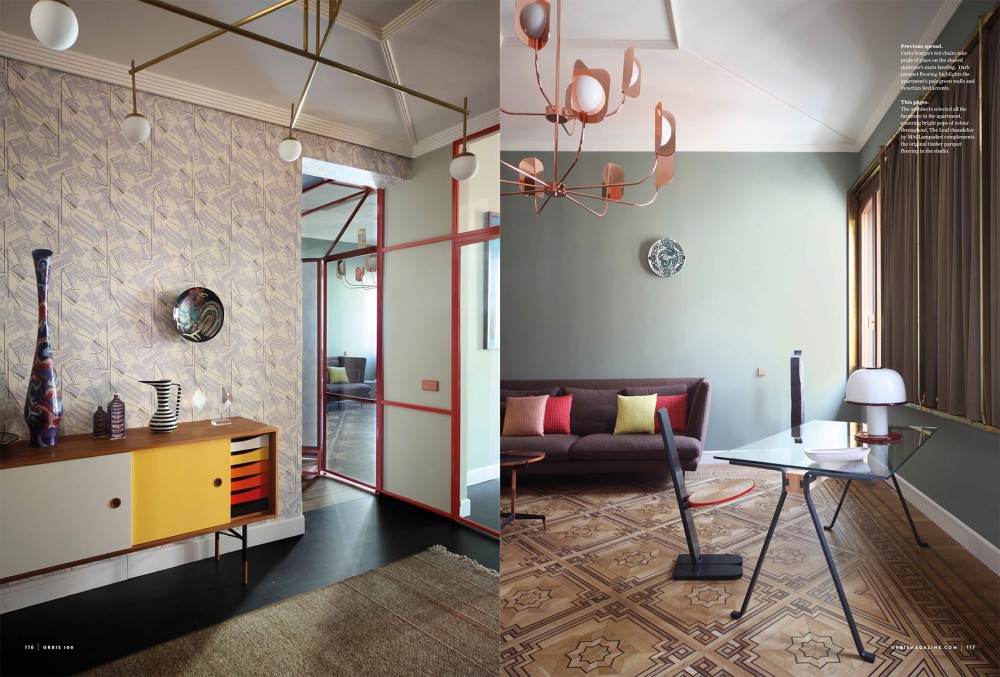
For inspiration, they looked no further than the building’s immediate surrounds and their resulting scheme succeeds in bringing the city’s spirit and energy inside. It’s evident in the staircase’s main landing where the walls echo a Venetian façade in their detailing.
However, the space is especially striking for a generous volume that playfully dwarfs the furniture, creating a wonderfully whimsical ambience. There’s something fairy-tale like about the whole effect, and in this respect the architects have perfectly captured the floating city’s magical essence.
This fantastical aesthetic extends throughout the apartment’s interior, where Marcante and Testa’s key objective was to introduce decorative elements that kept with the character of the building.
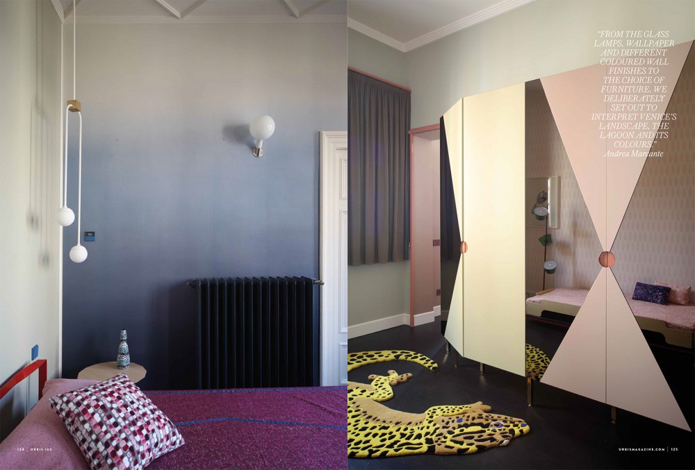
While no structural changes had to be made, attention was paid when plastering the walls, which were originally constructed using timber slats, a traditional Venetian building method. Once this neutral backdrop was achieved, the architects’ approach was nothing short of confident. As Testa reflects, “From the glass lamps, wallpaper and different coloured wall finishes to the choice of furniture, we deliberately set out to interpret Venice’s landscape, the lagoon and its colours.”
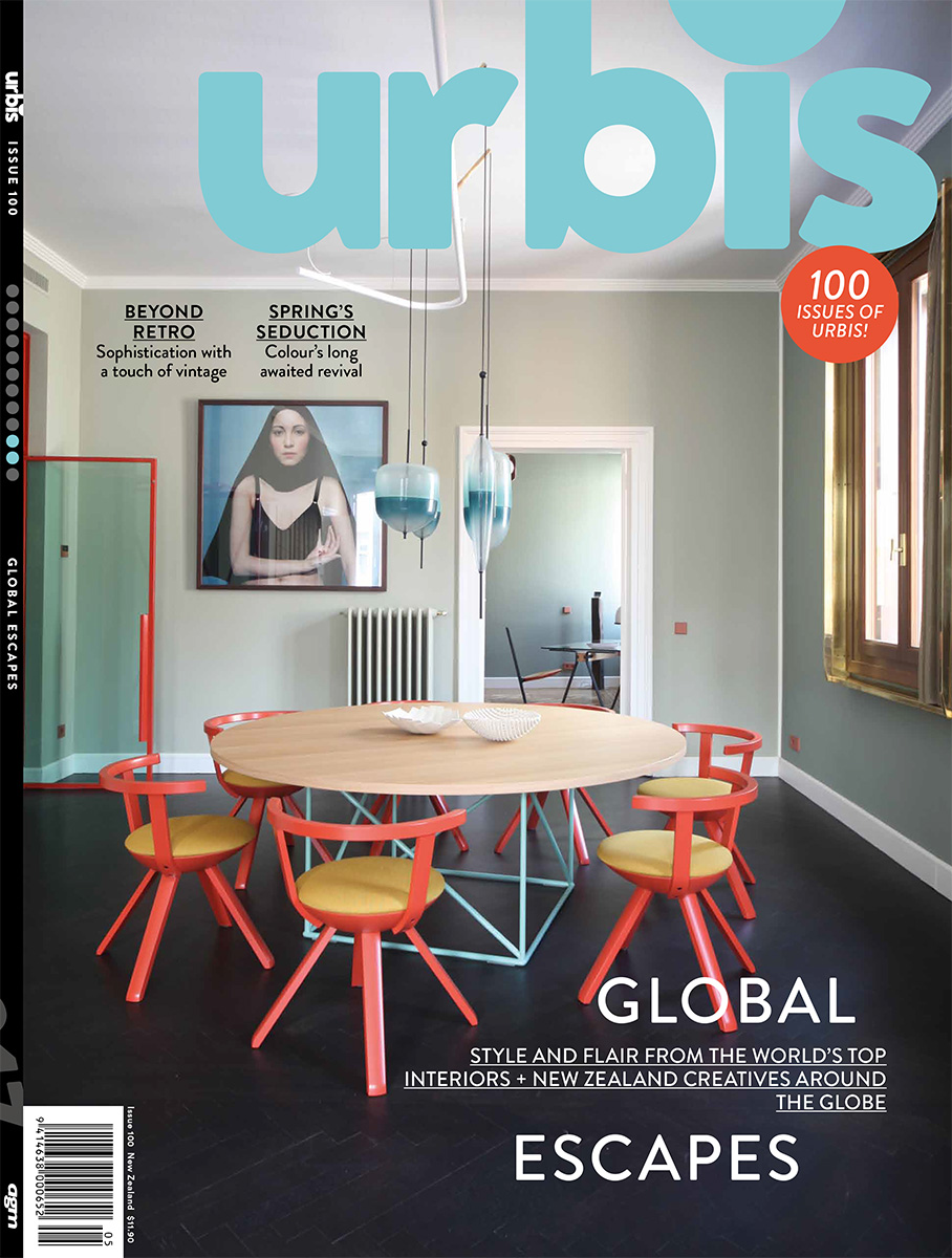
The colour palette is particularly revealing of their exquisite eye for detail, with a sensuous mix of blues, reds, greens and pinks creating a gem-like appearance. It’s like stepping into another world, and while the interior has a kaleidoscopic quality to it, nothing clashes, such is the fit-out’s level of sophistication and the overall tastefulness of the architects’ treatment.
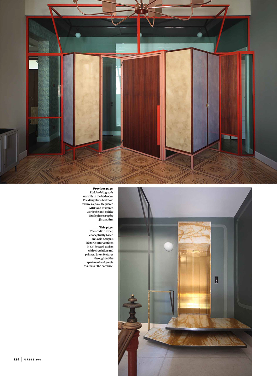
A series of freestanding metal-framed room dividers punctuate the living areas, giving the layout a sense of dynamism. Conceptually, these bespoke features are based on Carlo Scarpa’s 1956 interventions to the Ca’ Foscari, a significant Gothic building on the waterfront of the Grand Canal, and aid with circulation and privacy.
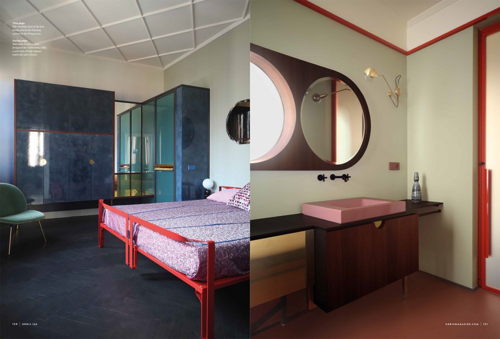
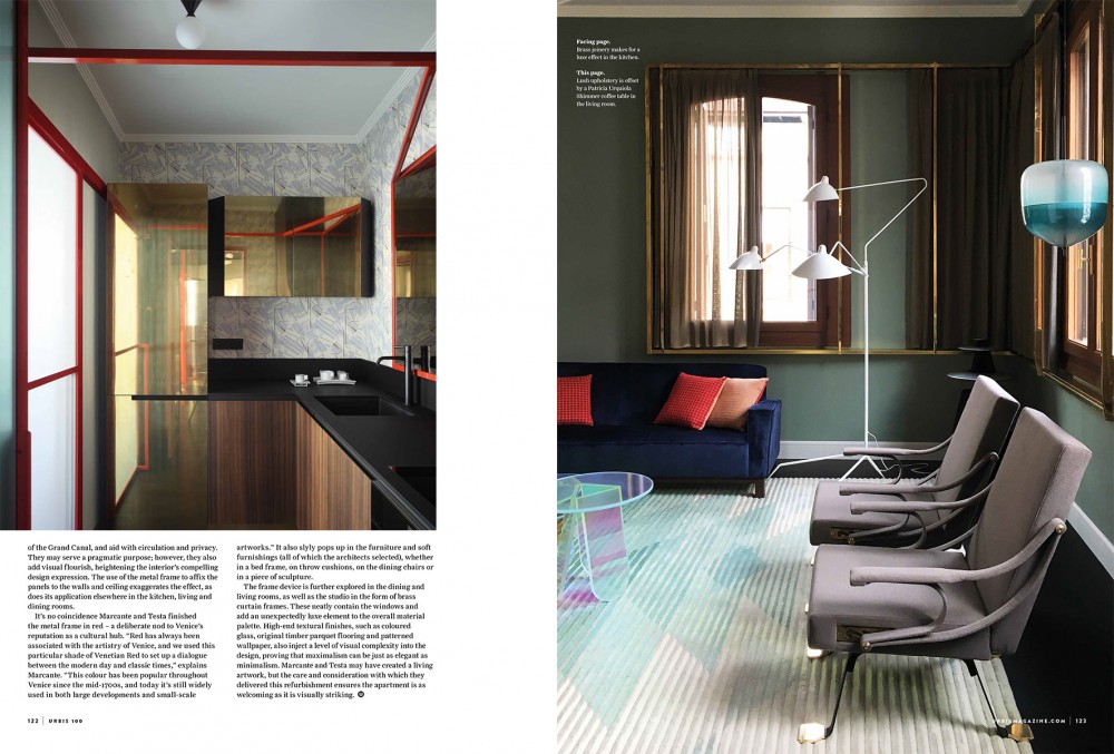
They may serve a pragmatic purpose; however, they also add visual flourish, heightening the interior’s compelling design expression. The use of the metal frame to affix the panels to the walls and ceiling exaggerates the effect, as does its application elsewhere in the kitchen, living and dining rooms. It’s no coincidence Marcante and Testa finished the metal frame in red – a deliberate nod to Venice’s reputation as a cultural hub. “Red has always been associated with the artistry of Venice, and we used this particular shade of Venetian Red to set up a dialogue between the modern day and classic times,” explains Marcante. “This colour has been popular throughout Venice since the mid-1700s, and today it’s still widely used in both large developments and small-scale artworks.” It also slyly pops up in the furniture and soft furnishings (all of which the architects selected), whether in a bed frame, on throw cushions, on the dining chairs or in a piece of sculpture.
The frame device is further explored in the dining and living rooms, as well as the studio in the form of brass curtain frames. These neatly contain the windows and add an unexpectedly luxe element to the overall material palette. High-end textural finishes, such as coloured glass, original timber parquet flooring and patterned wallpaper, also inject a level of visual complexity into the design, proving that maximalism can be just as elegant as minimalism. Marcante and Testa may have created a living artwork, but the care and consideration with which they delivered this refurbishment ensures the apartment is as welcoming as it is visually striking.”
(Leanne Amodeo)

