“In the artfully assembled apartment, a riot of finishes, shapes and colours (plus some sumptuously veined marble) coalesce richly under the expert guidance of the Turin-based studio.”
WORDS Elizabeth Pagliacolo
PHOTOS Carola Ripamonti


It all began with the corner window. The new owners of a Milan apartment fell in love with the floor-to-ceiling aperture and its unfettered view onto Corso Sempione. It was one of the main reasons they sealed the deal on the 160-square-metre space in a late-1960s mid-rise building. To say that it draws light into the living room is an understatement. The effect is magnificent – and it’s rendered all the more so by a luxurious marble surround installed by the duo, Andrea Marcante and Adelaide Testa of Turin studio Marcante Testa, hired for a post- purchase redesign.
“One of the most important issues when we came here for the first time was how to give value to this window, to this corner,” says Marcante. With the window as a prime focal point, the pair conceived the interior in a series of layers, with marble – in dramatically veined varieties – forming the foundational layer.
The blue-veined Cipollino Tirreno that encases the window stretches in linear slabs toward the dining area, where inlaid brass outlines the transi- tion to forest green Verde Alpi. (The designers worked with Gio Ponti’s favourite supplier of marble: Catella Fratelli, which the mid-century architect praises in his book Amate l’architettura.) In the dining area, the marble floor extends up to partially clad the wall, creating a ledge into which a shelving cabinet is recessed.
While the marble delineates the public zone’s two main spaces like carpeting, an elaborate brass-framed screen – made with glass and walnut and featuring a diamond-shaped mirror at its centre – divides the dining room from the corridor. But it does much more than evoke a sense of privacy: It supports a credenza, filters light into the corridor and, most idiosyncratically, features brass “arms” that emphasize the home’s spaces. “The arms are like arrows – indicators to take one’s gaze toward the outside of the living area or to connect the living area to the kitchen,” explain the designers. “With its arms, the screen is part of our research into creating space using very small structures.”
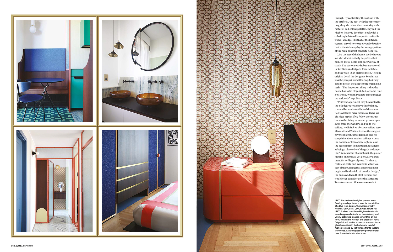
If we follow the screen’s cue and take a few steps down the corridor, we find a pocket door leading into a tiny galley kitchen: On both sides, the cabinetry is fronted in vibrant green laminate. Yet the sink is the same powder blue marble as the floor. It’s here that the designers’ wit shines through. By contrasting the natural with the artificial, the past with the contemporary, they also show their dexterity with material and colour palettes. Beyond the kitchen is a cozy breakfast nook with a cobalt-upholstered banquette crafted in wood – its edge, like that of the kitchen system, carved to create a rounded profile that is then taken up by the lozenge pattern of the high-contrast concrete floor tile.
Like the rest of the home, the bedrooms are also almost entirely bespoke – their painted-metal doors alone are worthy of study. The custom wardrobes are covered in Raf Simons–designed Kvadrat fabric and the walls in an Hermès motif. The one original detail the designers kept intact was the parquet wood flooring, but they couldn’t resist the urge to border it in blue resin. “The important thing is that the house has to be elegant, but, at same time, a bit ironic. We don’t want to take ourselves too seriously,” says Testa.
While the apartment may be curated to the nth degree to achieve this balance, it would be remiss to think of the attention to detail as mere fussiness. There are big ideas at play. If we follow those arms back to the living room and pry our eyes away from the window and up to the ceiling, we’ll find an abstract ceiling rose. Marcante and Testa reference the Jungian psychoanalyst James Hillman and his complaint about modern ceilings – once the domain of frescoed seraphim, now the access point to maintenance systems – as being a place where “the gods no longer live.” Reminiscent of a sunburst, the plaster motif is an unusual yet persuasive argument for ceiling sculpture. “It aims to restore dignity and symbolic value to a part of the building that is now the most neglected in the field of interior design,” the duo says. Even the last element one would ever consider gets the Marcante Testa treatment.

